Week 15: Final project 3

Here is a link to my final project 3 for CO221:

“This video is the opening movie title for Spirited Away (2001). I wanted to create a nostalgic, peaceful movie title because of this quote from the film: “once you meet someone, you never really forget them” which is said by Zeniba. I illustrated this nostalgic feeling through a bus ride (gazing out) and overlooking a bridge (running your fingers) and it has a non-dramatic storyline.”

Enjoy!

CO221: Week 13

I chose Zion. T’s “Eat” for an music video that has a non-dramatic storyline. This music video features Zion. T (who is a popular South Korean solo singer) and a female actress. Zion. T symbolizes her phone, playing the song, “Eat”. The music video means to take care of yourself even when you are busy. Zion. T symbolizes her phone because everyone brings their phone with them (in this case, she places her phone in weird places) and she is reminded to take care of herself and not forgetting to eat.

CO221: Project 3A

Our Visual Communications class are creating opening movie titles with Final Cut Pro for our final project. I decided to choose Spirited Away (2001), which is #29 on the IMDb Top 250 movie list

mv5bmjyxmdcymziznl5bml5banbnxkftztywndg2mdu3-_v1_sx640_sy720_

I grew up watching Studio Ghibli animation films as a child. I decided to choose between Spirited Away and Ponyo (both of them being my all-time favorites of many), which I thought I could fully use my creativity for. I chose Spirited Away because I visualized my opening movie title as simple and alluring.

For my proposal (word count: 200), I would like to do these things:

  • Use original footage of the beginning from the animated film: Chihiro’s car ride and then the arrival to the tunnel (goes up to 4:30 in the film)
  • Add in text and the transitions of these scenes so there will be enough time and space for the credits!
  • I wanted to use the film and compare it to real-life. I think it will be difficult to do since I need to research places that are similar to the tunnel. I would need an actress, a good day (with actual spring-like weather), and good equipment (a camera that records video). It will just be for a few scenes, such as the ones below that I can use for my opening movie scene and not use the animated film.
  1. (possibly of the girl sitting the back seat, bored)
  2. the tunnel that leads to the abandoned arcade
  3. sitting in a empty, abandoned train

The girl standing at a bridge (I was thinking about the blue bridge at the park in Arlington!) and trailing her fingers on it or following behind her as she walks and there’s a good view of the water and she looks at the clear and blue skies.

CO221: Week 10-11

For Week 10-11, our Visual Communications class were required to answer a few forum questions for Sharing 2: Opening Movie Title.

The first thing that I thought of (as an opening movie title) is the Harry Potter series. Majority of my childhood consisted of everything Harry Potter. The first few books were a gift by my grade school teacher. One of my first films I watched in the movie theater is Harry Potter and the Sorcerer’s Stone. The opening movie titles are classic and universal (familiar, consistent font, etc).

hp

Here is the video:

Although, if Harry Potter is taken (since I think it will be popular), here are my other two choices:

Spirited Away (one of my all-time favorite movies! The animation is very laid-back, it almost reminds me of a dream, especially when you see the Bathhouse/spirit night life later in the film)

I could not find a video of the opening movie title. I found a few images that I remember was part of the beginning/opening movie title:

936full-spirited-away-screenshot

d6980d7a0e39541f809e3a76956be82f-22


giphy

tumblr_mqpo02tak21rjrfrno1_500


Ponyo (I loved this movie and I remember being so mesmerized the second time I watched it with my niece when she was 4-5 years old! Everything about this movie is so aesthetically pleasing and very calming to look at.)

I also could not find the opening movie title – but I found a few images I remember were a part of the opening title.

tumblr_n1cf5obwly1r907hpo3_500

I actually wanted to do something cute, short, and creative – something that involves cheerios or toys. Although, I am not sure how it will flow…

tumblr_m3f2nx0mez1rtu8rqo2_1280

ponyoopening

So, here you go! Hopefully I can create a good storyboard. I can’t wait to play around with Final Cut Pro, since it’ll be my first time using it.


CO221: Week 9 (Project 2B: the cover)

For the second half of Week 9, our Visual Communication class were required to finish up photoshopping the book cover we chose to re-create. (Find the previous blog entry here: https://qyoto.wordpress.com/2016/03/15/co221-week-9/)

Honestly, I had some difficulty with Photoshop CS5. I wish we had more time to play around with the features and find out little tips and tricks of it. There is so much I wanted to change but I did not know how to change it through Photoshop (Google wasn’t a helpful tool to use either).

Here are the original book covers – Never Let Me Go by Kazuo Ishiguro.

41BhfQt1JvL._SX322_BO1,204,203,200_

never-let-me-go-kazuo-ishiguro

I was aiming for something similar and symbolic like this book cover:

Never_Let_Me_Go_Cover_Cargo

I liked these original book covers because they are very simple but also very attractive. I also love, love, love how the first two covers can be interchangeable (you can basically take the cover off – if it’s a hardcover).

At the end of Wednesday’s (March 16) class, I created a first draft (with help from my professor and a friend):

NLMG2

Here is my final draft of the book cover:

NLMG2copy

I am a bit satisfied with the book cover I created. There are a lot of things I wanted to change about my book cover. I made decisions quickly without actually thinking about the placement and how they would effect the viewer’s eyes. Halfway trying to change things up, I started to regret placing the design in the center of the book cover. I should have placed it on the front cover, under the title.

In my first draft, I was only thinking about the spine and how it would appear on the shelf. I wanted it to be unique without distracting the viewer. I did not want to start over again, so I ended up sticking with this book cover as my final draft. If I had another opportunity to re-create it, I definitely would have placed the design under the title! I am upset that I did not think it over. I am also upset that I couldn’t place the barcode above the price ($9.99) that I added. I tried hard to find the layer it was in (I cropped the barcode from its original image and dragged it from my laptop to the Photoshop app).

I had to move around the text (the title and the author) so it can be more balanced. I also remembered the classwork we did with playing around with the text format (I believe that we were creating a birthday invitation) on Photoshop. I chose Krungthep Regular for the font, since the novel is science fiction/romance. I chose this font because I because it displays the themes clearly without being too over the top.

It was easier to create a new book cover in my head. I am an artist and I like to create things by hand rather than using other tools to help me get it accomplished – if that makes any sense. I would have love to designed it with my hands rather than using Photoshop (or at least use Photoshop to enhance and edit).

Overall, the book cover that I re-created achieved a lot of things that I had in mind, such as:

  • minimalism
  • simple and clean design
  • clear design that is aesthetically pleasing and does not overwhelm the viewer

I am proud of this design despite the few flaws it has!


CO221: Week 9

For Project 2A: Book Selection, our Visual Communication class is required to find a book cover to re-create.

I had a very difficult time finding a book cover to recreate. I did not have a book in mind, rather, I had a lot of films that I wanted to recreate instead.

I settled down with “Never Let Me Go” by Kazuo Ishiguro. I am currently watching the on-air Japanese drama under the same name.

Never-Let-Me-Go-2016-Japanese-Drama-300x330.jpg

There are, of course, a lot of book covers that I have seen for this novel. I have not read the novel yet. I do plan to, though! The novel is about humans whose purpose of life is to harvest organs in their body to donate in the future. The novel also evolves around three characters — Kathy, Tommy, and Ruth — who have a complicated relationship. Since there are a lot of book covers that fit the plot so well (it’s a bit disturbing), I decided to go with this cover:

41BhfQt1JvL._SX322_BO1,204,203,200_

It fondly reminds me of Haruki Murakami’s 1Q84. You can take the cover off and it reveals the person’s face fully. I love that idea, since it’s really creative!

never-let-me-go-kazuo-ishiguro

When I think about recreating this book cover, I imagine two hands holding. I believe that the focus of the story is between Kathy and Tommy, since they develop a romantic relationship at the end. I want a minimalistic (but very appealing and eye-catching) design for the reader. A bit like this:

8715645a-a264-49ff-aed9-2a5da7dda1e5

I believe that the image above really depicts the title – “never let me go”. I can add the typography at the top of this image and probably change the color as well, maybe to a ombre (like dripping red and white?). It reminds me of this cover:

Never_Let_Me_Go_Cover_Cargo

I will definitely think of more ways to re-create “Never Let Me Go“.

CO221: Week 7

For the seventh week of this spring semester, we are required to do Reading 6, which is based on Chapter 10 (pages 134 – 154) of the textbook. I took the following pictures via my phone, capturing each category:

  • Symmetrical:

20150810_153310

I am having difficulty distinguishing between symmetrical (centralizing the objects) and asymmetrical (using the rule of thirds) pictures. This photo was taken at a nearby cafe in my neighborhood and has the lion as the center of it. The tables and lamps are what creates the painting of the lion to be in the center and gives it a dynamic.

  • Asymmetrical:

BestPhoto_20150731_174003_3

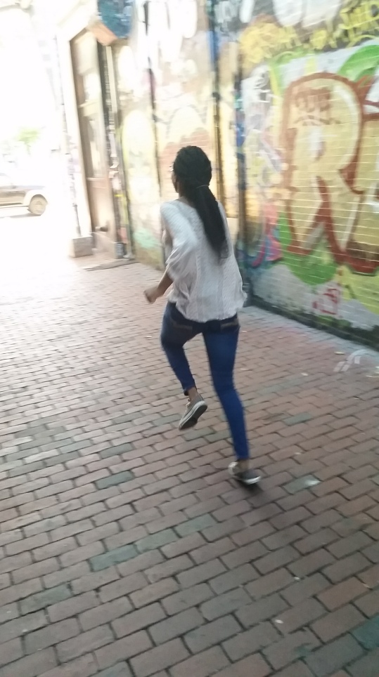
I thought this photo of my friend running is a appropriate example of a asymmetrical photo.  I tried to use the rule of the thirds, which makes me see the contrast between the large and smaller spaces of the image.

  • Shows contrast: 

20151206_144717

This picture displays contrast simply through the lighting (and also of the dark and light elements). Contrast often refers to something being different from something else. I actually wanted to put this under “shows influence through lighting” as well, but I decided that it fit well with the contrast.

  • Shows influence through lighting:

20151206_144723

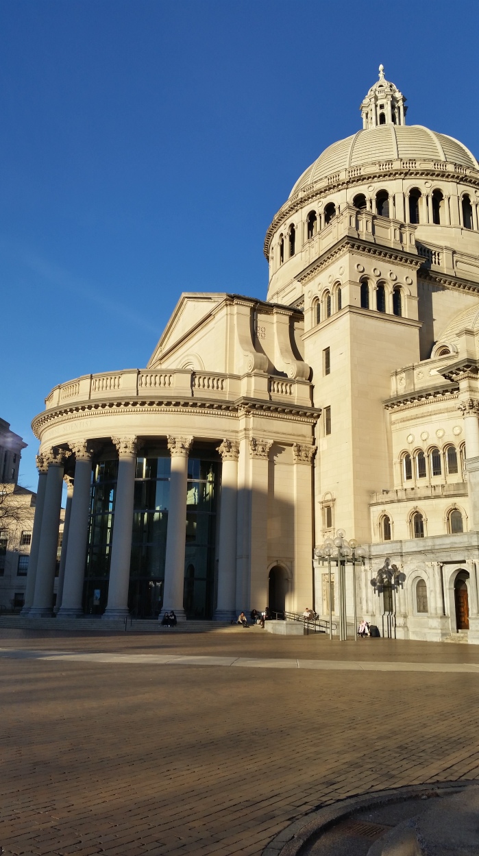
The lighting isn’t very obvious in this one – it’s in the buildings. You can see that there are shadows (direct light) coming from the buildings and behind the people. The building with the man on it almost doesn’t seem recognizable, since its color blends in with the sky. I believe that the lighting makes the viewer have a clear understanding of the photo, such as knowing what time it is (near evening) and the season.

  • Vertical: 

20151231_155001

I did not only choose this picture because it is in a vertical format, but also because you can feel something when you look at it. The towering buildings, the people in their jackets, the contrasting of the buildings.

  • Horizontal:

20160103_162320

I chose this to be under the horizontal category because: the focus is the Darth Vader plush. You can see the other dolls around it, along with the ceiling of the store.

  • Long shot:

Snapchat-8860359808045925634

Long shots allow enough space for the atmosphere and setting  to be grasped by the viewer. I wasn’t sure if I wanted to take a photo in the worm’s eye view (camera is placed low) or the bird’s eye view (camera is placed high). In the picture above, I chose to take it from a worm’s eye view. My position and angle really flaunts the building and how tall it is, along with the sky and the shadows of the other buildings around it.

  • Close shot:

Snapchat-4135458170119695859 copy

I didn’t take a close shot from the same location I took for the long shot.

However, meet Andy. This is Professor Murray’s (from the Communications Department) dog. He’s a sweetheart and a bit shy.

In the textbook, it said that the most common way to illustrate a close shot is to have the person be in the center of the image. I shot this photo right when Andy was looking at my direction, which, I believe, gives intimacy to the viewer.

Week 6: reading 5

Formatting images are important because you want to attract the receiver’s eyes, like making it look pleasurable to look at. This is also known as “attracting and orienting” (A&O). There are a lot of subjects to take in when formatting an image: symmetry, asymmetry, contrasts, lights, shadows, space, and so much more! There’s a lot of effort and thought being put into these things. Formatting text is also very similar to images — except, I believe that the image is more like the foundation/ground for the text. The text is like the blanket and adds more structure to the overall image.

The text and images are different from the web, television, and to an ad because:

Web: can be replicated, digitally enhanced

Television: has support from audio and often has a narrative, credits

Ad: location, headings, flexibility (such as size)

Within all of these formats, a logo is used by: being recognizable, unique (also refers to it being timeless), be adjustable (referring to it being able to be used in large and small spaces).

Here are a few examples:

Print ad

4305ebbe02c3eb550ff3d72b8e9d31c8

Online ad

Screen Shot 2016-02-25 at 11.04.21 PM

television ad

CO221: Week 6

Print

(attn: the above image is from risarodil.tumblr.com, Divergent is one of my favorite books of all-time!)

Hi! This is in response to the forum for Reading 4, which is based on Chapter 13 of the textbook.

These are the questions: When creating your book cover will you use color to attract, create atmosphere, inform, structure, or teach through your design? Why?

I would want to inspire people when they see my book cover. I would like to use color to attract, create atmosphere, inform, structure, and teach others through my design. I want to create a cover that is pleasing to the eye and is intriguing. It makes people want to read on and dive right in.

Based on the classwork we did in photoshop, I got inspired by seeing the work my classmates did and found out what I would like to do for my own book cover. I would like the colors and structure to match with the meaning behind the book cover. The atmosphere would come from the colors I create the book cover in. The overall book cover will inform the reader what it will be about and intrigue them. The structure will come from the book cover’s complexion and completion. I would like to teach others to be creative and inspire them that anything is possible.